

Creating variety in color is an art of infinite nuance. As with any good form of art, however, the basics of creating color schemes can be drilled down into a relatively simple skill set. From this groundwork, you may expand your own creativity.
The purpose of learning the basics is to learn the natural harmony of color. Complex nuance forms the icing on the cake, but color follows these basic tenants at all times –
-
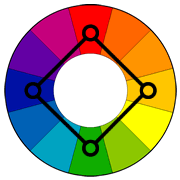
Opposing and assembling colors – Certain colors oppose or build upon each other. Studying the color wheel can help familiarize you with the basic color sets that have been shown to bring certain emotions and aesthetics out of a combination.
-
The use of neutral colors – Brown, beige, navy and gray meld your other colors to each other and create harmony between shades and different frequencies of light that might otherwise have trouble occupying the same space.
-
Black and white – Light plays a pivotal role in the harmony of the colors you use within a piece. White tends to illuminate the rest of the set (increased intensity), and black tends to blur the other colors you use (moderating intensity).
Once you know these basic rules of harmony, the next step is learning how to create harmonious color schemes within your own look. The monochromatic approach uses a single color shade or tinted of various values to generate harmony. Further, six techniques give us the basic tenants that run through all artistic schematics. They are Complementary, Analogous, Triadic, Split-Complementary, Tetradic Gold Rectangle and Square (four colors).
Complementary

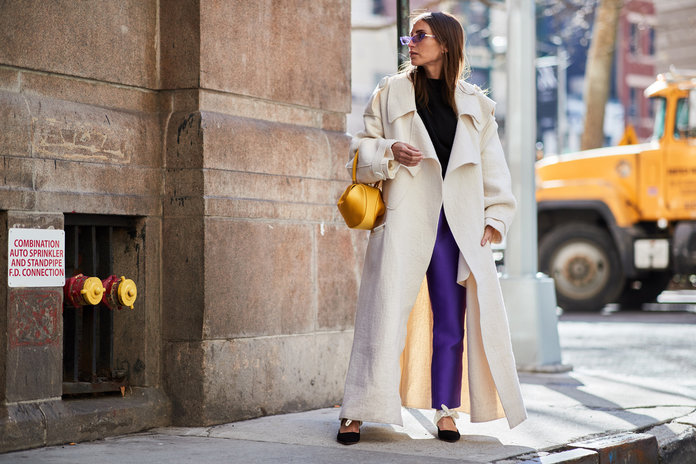
Complementary colors are basically opposite colors on the color wheel mentioned above. Use these combinations when you want to create a high impact. These colors naturally draw the eye and are most effective when they are used judiciously on the most important items of your outfit.
Photo: In Style

The Guardian

Pinterest

Voonik fashion
Analogous

This low-contrast combination of colors produce an almost monochromatic look but is more dynamic. Contrary to complementary colors, analogous colors generate a sense of calm. Look to any three neighboring colors on the color wheel if you want to create this effect. However, the balance between the three colors you choose is very important. In most cases, one color is chosen as the central thematic while the other two serve as support. Note: You can also go for diad schemes, which are combinations of two colors located two steps apart on the color wheel, skipping the color in between.

Popsugar.co.uk

Getty Image New York Fashion Week 2018
Triadic

Colors that are evenly spaced around the color wheel are known as triadic. They will form a triangle if linked with a straight line. Triadic colors give a balance between the attention-getting Complementary color scheme and the calming effect of Analogous colors. It is also recommended here to pick one color as the primary theme and use the other two as complements.

Pinterest

Vogue
Split-Complementary

If you choose a base color with two supporting colors directly opposite on the color wheel, the result is a slightly more demure version of the loud Complementary style. This is a less risky choice than a pure Complementary schematic and may be used if you wish to draw less attention at first glance.

Pinterest

Vogue

Pinterest
Tetradic Gold Rectangle

Instead of using three colors on the color wheel for a particular schematic, the tetradic gold rectangle uses four. More color means an opportunity for a richer, deeper tone, but only if the colors are employed properly. In the Tetradic Gold Rectangle, the four colors are arranged into two complementary pairs and balanced between the group of two and again between the larger groups. If a straight line is drawn between the four colors in a Tetradic Gold Rectangle, a rectangle is formed.

Pagnifik.com

Pinterest, Brand – Demestiks
Square
Similar to the Tetradic Gold Rectangle, the Square color schematic uses four colors. However, the colors chosen are spaced evenly around the color wheel. A straight line drawn here to attach the colors forms a perfect square.
These colors tend to be evenly warm and cold, requiring a practiced hand when balancing the look. Because the colors themselves are balanced, the artist often has to create imbalance in order to achieve a particular effect. Tip: Pay particular attention to the cut of the garment and favor asymmetrical designs. As with most of the other schemes, the Square works best if one of the colors is chosen as the dominant force while the other three are supplements.
Easy to learn, a lifetime to master – these six techniques will certainly begin your journey into a better understanding of color. Although these techniques are called “basic,” they tend to last a lifetime!

Enews

Hipboulevard.com

vogue.fr


That was such a great read! 💕
LikeLiked by 2 people
Thanks! You are so kind. I have some other posts on this topic coming soon. Thanks for stopping by. 💕
LikeLiked by 1 person
Wow! I won’t be able to get dressed tomorrow, for fear of not putting the right colors together! In that case, I declare tomorrow naked day!! (Ok, not really, but I will go with all black to be safe!) 😉💚
LikeLiked by 3 people
Oooooh no — The objectif of my post was to encourage people to embrace colors and not to be afraid to mix and match. Besides, you live with colorful flowers and critters, you need to show your own colors my friend. All black is okay, but even better if you wear it with colorful accessories! A blue bandana or casquette with a tan belt perhaps… That would be lovely with your blond hair. 💚
LikeLiked by 2 people
😬😬😬 you would probably cringe at some of my concoctions!
LikeLiked by 1 person
Nope. I am all about “Whatever makes people happy”… As long it does not hurt anyone of course. But I know that is not your style. xoxo
LikeLiked by 1 person
💚💚💚
LikeLiked by 1 person
Naked day!? In a Michigan winter!? Brrrrrrrrrr😄
LikeLiked by 2 people
Even worst, she wants to wear all black! 😄
LikeLiked by 1 person
😄😄😄
LikeLike
Ha! I knew you would enjoy that comment!
LikeLiked by 1 person
😄😉
LikeLiked by 2 people
It took me by surprise too! And it made me laugh. 😄
LikeLiked by 1 person
This is nice. I remember doing a post like this on colour blocking too, so I got really excited reading this one.
♥️
LikeLiked by 2 people
Thanks. I will go and check your post. 😄Speak to you soon. Have a lovely day.
LikeLiked by 1 person
This is a wonderful post. A great and interesting read and much of the info is useful to me as an artist too. I will remember this next time I want to combine different flowers in a composition. I was aware of the opposite complementary colot.urs e.g red and green but not the other combinations. I probably use them subconsciously but without knowing why they look right. Hugs😍
LikeLiked by 1 person
Thanks so much Darren. So happy that you find it useful. Such a pleasant comment, especially coming from a talented artist like you. I’m so inspired by your artwork. Sending you a huge hug my friend.
LikeLiked by 1 person
You are the best. lovely post. That colour wheel thing was just awesome and those kaftans more than awesome. loved it
LikeLiked by 2 people
What a lovely comment. Thank you Shreya. I love these Kaftans too. If I could get my hands on one of them it would certainly take me for a ride over the rainbow! Thanks for stopping by my site and have a lovely day.
LikeLiked by 1 person
A lovely year to u ahead😍
LikeLiked by 1 person
Thanks!!!!! Ditto. 😄
LikeLiked by 1 person
Really inspriring but might take a while to actually put it into practice.
LikeLiked by 1 person
Hi Alison. Just start by adding one or two colors to your neutral. Gradually, you might want to include patterns, more colors and details. Try it first then you’ll decide if it works for you or not. Have fun.
LikeLike
Very interesting one Dominique 🙌Being creative with colors is really bae😍with fashion and thanks for the encouragement 🤗liked the color charts😍Really enjoyed the way you presented it.Great series on color!
LikeLiked by 1 person
Thank you Sharon. I knew you would like it. I have another post on the topic coming soon. P.S. Your video on color trends was a big success! Great job.
LikeLike
I really like this post ..is a wrap. I can’t wait 😊 for your next one. Thanks dear and enjoy the rest of your day ✌️
LikeLiked by 1 person
Again, thanks so much Sharon for your positive feedback. Have a beautiful weekend. xoxo
LikeLike
Totally love this post, since I really love to wear colors a lot! My favorite combination is the triadic one, though I often en up wearing either color schemes from the Tetradic Gold Rectangle or Square. I just love mixing colors (must be the artist in me 😉 ) and being bold is my motto. 😀 But every once in a while, I also like wearing a pure black outfit, only highlighted by a bit of colorful jewelry. 😉
Have a wonderful day, mon amie! xoxo ❤
LikeLiked by 1 person
Hello Sarah. Almost no one wear now a day color schemes from Tetradic Gold Rectangle or Square. I spent hours trying to find street style images online that were not dated. I could only find a few. I must have a split personality 😀 as one day I love mixing and matching colorful clothing and patterns and the next day I’m all about monochrome or analogous color schemes. In any case, I like it to be comfortable and elegant though. I really don’t like the clown effect. Wishing you a creative day my friend. Again, thank you so much for the beautiful gift you have sent me. You are awesome! 😍
LikeLiked by 1 person
Then I must have a split personality as well! LOL! 😀 And I´m with you on not liking the clown effect! Being rather small in stature I´m always afraid of looking like a child should I overdo it with the colors and patterns 😂
Have a fantastic weekend, dear friend! ❤
LikeLiked by 1 person
😂😂😂 Good point! You made me laugh.
LikeLiked by 1 person
This was such an interesting read! I’ve always felt a sense of ease or excitement when combining certain colors and now I know why! Thanks for the tips!
LikeLiked by 2 people
Thanks so much for stoping by. It’s always a pleasure to hear from you. Want to know why I like colors so much? My son is color blind and he only sees some contrasting combinations. It is one of the reasons I started to wear colorful clothing. I just did not want him to see the world in black and white.
LikeLike
You make it sounds so easy, yet I always look like a clown when I try this myself! Perhaps this is why I usually wear work out clothes! 🙂
LikeLiked by 2 people
The easiest way to introduce color to your look is to combine two colors located two steps apart on the color wheel. You just have to skip the color in between. With this tip you won’t look like you got dress in the dark. BTW, work out clothing can be colorful too. 😍
LikeLiked by 1 person
Hey darling, how are you? I nominated you for the Liebster Award on my blog!! ❤ check my last post, can’t wait to hear from you! 😗
LikeLiked by 1 person
Congrats to you Brigida for this well deserved award. Thank you for nominated me. I’m touched that you thought of me and very honoured. I’m behind my award thank you posts so please be patient with me… 😊 Speak to you soon.
LikeLiked by 1 person
Thank you darling for being such an awesome blogger and sharing your useful tricks! ❤
LikeLiked by 1 person
Thanks dear. 😍 Have a good weekend 🌼
LikeLiked by 1 person
You too ❤
LikeLiked by 1 person
Allo Dominique!
Cette fois ci jai ecrit mon commentaire sur fb hier matin. Du moins je crois car je ne le vois pas 😯…
LikeLiked by 1 person
Rebonjour Imelda. Il y a un coeur avec ton nom sur la page Facebook, mais pas de commentaire. As-tu appuyé sur le button “Send”? J’oublie parfois moi-même de le faire. À bientôt.
LikeLike
Bonjour Imelda. Je vais aller voir sur ma page Facebook… À +
LikeLike
Je crois bien que je l’avais écrit sur le site. Mais parfois on dirait qu’il faut s’assurer qu’il est parti. Genre peser deux fois sur send…
Donc en substance je te disais que c’est un superbe post! Très étonnant pour la néophyte que je suis. Parfoos je vois des tenues superbes mais je me dis que je n’aurais jamais osé cette harmonisation de couleur. Ça me dépasse. .. Là je vois ce qu’il y a à la base de ces combinaisons sophistiquées. Je ne my oserais jamais de peur de commettre la gaffe du siecle 😄!
Je pensais a la robe rose d’Emma: chaussures grises là je comprends, mais le sac bleu là je suis in peu perdue. Comme tu vois j’en arrache avec le concept😢 … jai enregistré ce post pour le relire . Le photos sont un atoits enormes au texte.
Merci et a plus! xoxo
LikeLiked by 1 person
Merci encore pour ton gentil message Imelda. Bien sûr que le sac sera joli avec la robe d’Emma. Celle-ci n’est pas rose mais rouge coquelicot avec du blanc, du noir et du gris. La pochette est vert menthe. Une sandale métallique complètera la tenue parfaitement. Une association de couleurs idéale pour célébrer un mariage en mai! Emma sera magnifique et élégante.
LikeLike
Tu vois jai du peser deux fois sur send avant qu’il ne parte … bizarre 😠
LikeLiked by 1 person
C’est comme avec les enfants, il faut répéter plusieurs fois….
LikeLike
Brilliant as always and love all
Of your hard work that goes into this treasured advice. Watch for a little dedication 😉
LikeLiked by 1 person
Thank you Margit. I have not been blogging much this month as there is a lot going on in my life right now. Your comment brings a big smile to my face. Thank you my friend. ❤️
LikeLiked by 1 person
Hoping you are ok and sending much love your way. ❤️
LikeLiked by 1 person
I will be fine. Do not worry about me. Thank you and take care of yourself. You have a much more difficult journey ahead. Big hug to you my friend. xoxo
LikeLiked by 1 person
Needed, thank you ❤️
LikeLiked by 1 person
Big thanks to you! Sending good vibes your way. ❤️
LikeLiked by 1 person
Xoxo thank you
LikeLiked by 1 person
Great post. Very practical and practicable!!
LikeLiked by 1 person
Hello Aditi. Thanks for stopping by and for your kind comment. Congrats for your two peer-reviewed research papers that got published. I know it is tough to get funds and to be publish so you have the right to be proud! Hope to speak to you soon.
LikeLiked by 1 person
Thank you so much!
LikeLiked by 1 person
You have exquisite taste and such an innovative sense of style.
LikeLiked by 1 person
Ooh Cathi that is so nice of you to say that. 😊 Muah!
LikeLike
hi,
I’m best fan of you,because your post are so wonderful and i really like that,keep up and thanks to writer for sharing…
https://www.lukhidiamond.com/LOOSE-DIAMONDS
LikeLiked by 1 person
Thank you for your comment and for visiting my site.
LikeLike