Fashion is about color, and color is more complicated than we were told, that is, the basics of everything we see boil down to three primary hues – red, yellow and blue. Master the interplay between these three tools, and you have mastered colorimetry.
This is, at least, what our elementary school teachers tell us.
New research may actually point to a slightly different set of primary colors that are based on the way that our eyes receive wavelengths in the spectrum we define as visible light. To be purely scientific and biologically precise about the whole issue, the primary colors should be defined as red, green and blue.
3 colors to rule them all?
Wait just a minute – don’t you have to mix yellow and blue to get green?
If we are talking about paint, yes, you are absolutely right. However, light works in a different way from solid and liquid pigments.
First of all, to understand color, you must understand that there is really no such thing as color of an object! It just reflects and absorbs selective components of the light. Our eyes detect the color that we see based on the three strongest wavelengths that occur within the information coming from the retinal receptors. These activations show up in our brains as red, green and blue.
Colors from paint, or pigments, are viewed differently in the eye. In order to make a color pigment, paint makers actually take real color out of the solid/liquid substance that comprises the paint. In short, you are not looking at a full color spectrum when you see red paint like you are when you see red light. This difference allows paint pigments to add to each other in your eye instead of your eye having to subtract and approximate the color it sees.
With pigments, subtracting red away from the “full spectrum” makes you see cyan (blue). If you take green away, you see a purplish red (magenta). If you take away blue, you see yellow. So if you want to be completely correct about the primary colors of pigments, you should actually say they are cyan, magenta and yellow. Culture simplifies this to blue, red and yellow.
Great. All of our kindergarten teachers were wrong. So what does all of this mean for your fashion sense? All of your efforts to find true primary colors should lead you into an effort to find complementary colors (also known as contrasting colors) and analogous colors. This is the true art of fashion, and it is what makes things look fashionable to us.

For instance, mix together yellow and blue paint. Does this give off a color that is pleasing to the eye? More importantly, does it give off the color that you and your elementary school teacher expect? Compare this hue to what happens when you mix purple with yellow.
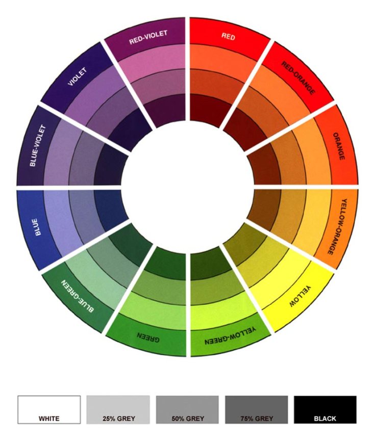
Most people will naturally find purple and yellow paint more appealing than blue and yellow. Why? Purple and yellow paint are opposites on the color wheel, which is a tool that stylists, decorators and graphic designers use to find complementary colors. Complementary colors have hues that naturally appeal to the eye when mixed. Green is opposite red, Purple is opposite yellow, and orange is opposite blue.
Next time you are trying to “mix” an outfit, try using this professional color scheme instead of your elementary school approximations. You may find that you end up with a much better outfit. Note that a complementary combination is one of the six basic techniques for creating color schemes. These schemes are:
-
Complementary
-
Analogous (colors that are adjacent to each other on the color circle)
-
Triadic
-
Split-Complementary
-
Gold Rectangle or Tetradic
-
Square
I have review them in details HERE. The good news about all of this is that color is relative. Whether or not you decide to go with the real primary colors of pigment, the fake ones or the primary colors of light, their relative complements will always give you a great look as long as you know what they are. In truth, you can start from whatever base you like. Just make sure that you are complementing the base that you choose with hues that play well from it.
In order to help you, I have produce a list with pleasant combinations of individual color.
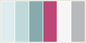
Gray works well with…
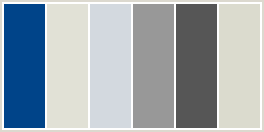


Tan works well with…


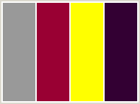
Red works well with…


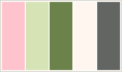
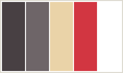

Midnight Blue works well with…
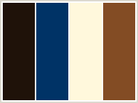
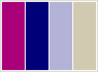

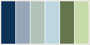

Brown works well with…
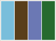

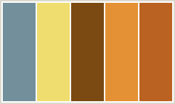
Fushia works well with…


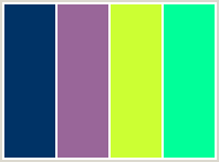
Green works well with…




Blue Green works well with…
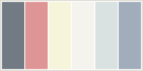
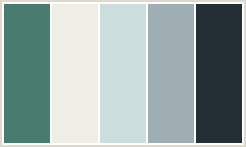

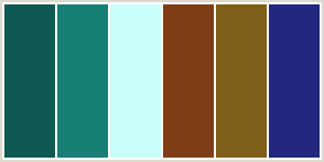
Orange works well with…

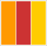

Baby Blue works well with…


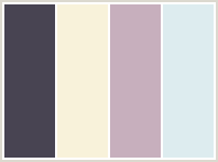

Yellow works well with…


Purple works well with…

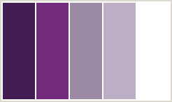

Keep this in mind if your artistic eye fails you, and you are sure to come up with ideas that will please!
One last tip. When you wear a neutral color scheme (gray, beige and brown) with color accessories, use TWO color accessories to make your outfit pop-up. They can be in the same hues, analogous or complementary colors. But remember: two instead of just one. Otherwise, the outfit becomes about that ONE accessory when the star should be YOU!
Photography of 3C Style by Annie Gaudreau 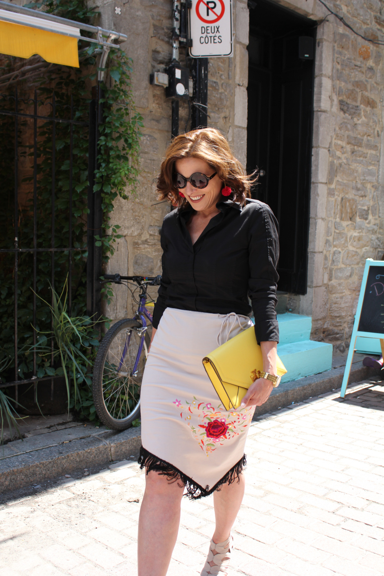
Let’s stay connected: Bloglovin – Instagram @3cstyle_fashion
If you liked this post, you’ll love these
The Rule of Thirds, The Harmony of Nature and your Fashion Sense
3 Tips to De-Stress
Why do I collect old keys?


I love the greens! One can never have too much color!
LikeLiked by 4 people
Agree with you Sis!!!
LikeLiked by 3 people
Très intéressant cet article Dominique. Tu maîtrises bien ton sujet visiblement.
Je te souhaite une agréable journée.
Tony
LikeLiked by 2 people
Merci Tony. Je m’intéresse aux couleurs, leurs associations, les illusions qu’elles peuvent créer et leurs effets sur les gens depuis de nombreuses années. Mon fils est daltonien et son handicap visuel est à l’origine de mon intérêt. Belle journée à toi également. xoxo
Like
A fascinating study. I have always wondered too if each individual SEES or rather INTERPRETS colours differently. As people age I am told the brightness of colours dims slightly resulting in brighter lipsticks and so forth. Maybe when you say fire-engine red I see rose red? Or maybe that is more of a study of words. We may see the same colours but name them something different? What do you think. Any basis for this odd hypotheses? c
LikeLiked by 6 people
Oh I should qualify that – I did not mean ONLY the elderly sees colours differently – I am wondering if each persons sight might be slightly different. From birth.
LikeLiked by 3 people
I have always wondered this too. If we could see through another’s eyes would colours look the same?
LikeLiked by 3 people
It is something we will never be able to totally resolve. 😍
LikeLiked by 2 people
It is a very interesting point Cecilia and I have reply to you in your other comment. Thank you so much for taking the time to read this not so fashion oriented post. Have a lovely day!
LikeLiked by 1 person
There are several points to make about your comment Cecilia. First, you are right colour perception is primarily a brain function and depends on many factors such as context, and even social experience. In regards to your other point about aging, the cristallin lens change with age becoming increasing yellow (filtering blue light) so the chromatic energy reaching the eye changes in time. However, colour discrimination tends to remain similar, which means that there is some adaptation by the neural system. One thing note is that the photoreceptor array is quite diversified in humans yet we tend to have similar colour perception classification. So yes we may actually perceive different colours but use common nomenclatures. Hope I did not create too much confusion here as colour perception is a very complex topic. Unfortunately my husband is an expert on the subject and for the life of me I can never get a simple answer. BTW This is how I met my husband as I interviewed him for a paper on colour blindness. Ironically, our son is colour blind.
LikeLiked by 5 people
What a great informative response❤
LikeLiked by 2 people
Poor Cecilia. I’m afraid she will never write a comment to me again!
LikeLiked by 2 people
I am sure that is not the case!😄
LikeLiked by 2 people
She did wrote back to me. Wow, she is a brave woman!
LikeLiked by 2 people
Older people get cataracts – it’s natural, it happens to everyone I gather (according ot my optician, anyway!) and with cataracts, blues and purples start to become grey or black and colours taken on a yellowish tinge. Then there are people who have colour blindness.
LikeLiked by 2 people
You are right Val. The crystallin lens becomes more and and more yellow with age. Thanks for your comment.
LikeLiked by 2 people
Superb article! Thank you!
LikeLiked by 3 people
Thanks to you for reading it!
LikeLiked by 2 people
Need to be more careful picking colors now😳I love the sunglasses and the skirt too😍
LikeLiked by 3 people
You have keen eyes. You always point to the designer items! 💕
LikeLiked by 2 people
I have been trained by a good teacher……my mother😉
LikeLiked by 2 people
Ha, so am I 😊
LikeLiked by 2 people
No doubt😉❤️
LikeLiked by 2 people
❤️❤️❤️
LikeLiked by 2 people
You are welcome my friend! 😊❤️
LikeLiked by 2 people
This is a wonderful post full of great ideas and the science behind them. I love it!!! ❤️💕❤️💕❤️
LikeLiked by 3 people
Thanks Linda. 💕
LikeLiked by 2 people
Reblogged this on Pepsy Quinqua ! and commented:
La vérité sur les couleurs primaires….
On bouscule les codes, les idées reçues…On s’appuie sur notre appréciation pour trouver les bonnes associations et créer son style !
Merci Dominique pour cet article.
LikeLiked by 1 person
Merci pour le reblog! Tellement joli ton site. J’ai bien envie de le découvrir davantage. Et félicitations pour l’heureux événement qui aura lieu en juin! Au plaisir de te lire. Dominique ❤️
LikeLiked by 1 person
Merci ! J’adore ton blog ! A bientôt !
LikeLiked by 1 person
Ditto!
LikeLiked by 1 person
Another fascinating post. You express these colour theories so well and make them accessible. I always learn new things from your blog!
You already know I love that skirt! Just don’t push the sunglasses up onto your hair as this has profound effects on me 😉
LikeLiked by 2 people
Ha, ha… I promise never to do the sunglasses move in your presence! I always learn new things from your blog as well my friend. 😍
LikeLiked by 2 people
Thank you so much and thank you for such an informative response. I have rather a solitary job so I was able to take your words with me and mull them over for the day. You have not confused me at all – rather clarified some things. Thank you. My first husband was colour blind – but he said it was only mild (though I was never sure what that meant – red/green apparently) but I have always wondered how one would discover that this, when in a child’s development would she realise that something was amiss. Perception is such a delicious word. Something we forget about – how we might all perceive things slightly differently so if we do disagree someone is not always necessarily wrong. Anyway – time to dress warm and go out and check the new piglets. Thank you again. c
LikeLiked by 3 people
The majority of colour blind people have problem with the Red/Green receptors. Some people are totally missing one receptor type and they are called dychromats. This is the severe type and about 1 percent of males. Most of the others (about 7% of males) have three receptors but one is shifted compared to normals, which causes some colour confusion but not as severe as the dychromats. Here is a site where you can test your color vision or that of your child if he knows his numbers.
LikeLiked by 2 people
Oups, I forgot to add the link. Here it is: http://enchroma.com/test/instructions/
On my way to see if you have put pics of your piglets on your blog! xoxo
LikeLiked by 2 people
They are coming. Because my sows ( and their piglets ) are not caged, it always takes a few days before everyone is calm enough to take in the camera
LikeLiked by 3 people
Thank you – I will send this to David – I don’t believe he ever investigated much further. Could be interesting!
LikeLiked by 2 people
I’ve always used instinct to choose what colours I wear together, I’m afraid. But I probably use a certain amount of basic colour theory (which has now become instinctive rather than formal) in what I do – which is colouring photographs. For instance, unless I know an individual is wearing red, I won’t use red for someone’s clothes if they are in the foreground or they will stand out too much as red brings things forward (and blue takes it back.) So maybe that’s one thing to also apply to fashion?
LikeLiked by 3 people
What a cool job you do! The effect of forward and receding colours is called chromostereopsis and is due to the fact that different colours refract light at different angles creating a disparity between the eyes. The brain then takes this disparity and can recreate depth. The direction of the colour depth however depends on individuals. For more information, see the wikipedia text on this link: https://en.wikipedia.org/wiki/Chromostereopsis
The first 2 citations are in fact papers by my hubby 😉 Thank you so much for taking the time to read me and to comment. I appreciate.
LikeLiked by 3 people
Thanks!
LikeLiked by 2 people
My pleasure. Thanks to you for stopping by. 😉
LikeLiked by 2 people
Val, I went to visit your blog before going to work and oh my I will explore it more this weekend for sure! I just wanted to let you know you are doing a fabulous job with these photos. I’ve got to go now but you will hear more from me soon. Have a lovely day.
LikeLiked by 2 people
Thank you! I’m glad you like my blog and colourings.
LikeLiked by 2 people
I sure did!
LikeLiked by 2 people
Oh no! Does this mean the gallon of bright yellow that I just bought will not look contrasty enough with our red-orange brick wall!
I am going to print this post out and tape it to my walls so I get it right next time!
LikeLiked by 2 people
No problemo DEE-DEE. Just stand in front of the wall and it will instantly brighten the room! 😍
LikeLiked by 2 people
I am going to post a before and after picture and feel free to use me as the “how not to decorate a room” post! 😂😊
LikeLiked by 2 people
I would never do such a thing! BTW I did vote for you and Annika for the Award. Hope you will each get one. xoxo
LikeLiked by 2 people
Oh, thank you!
LikeLiked by 2 people
My pleasure! You deserve it.
LikeLiked by 2 people
I absolutely love this post and the comments. The science behind it fascinates me, too. Speaking of chromostereopsis, I often wonder how others process, if everyone has a slightly different perception. Very keen on the color palette as well. The yellow purse, well you know, that makes me smile 💗
LikeLiked by 2 people
Hello Sis! What is interesting about chromostereopsis is that it really depends on the optics of the eyes and this varies a lot in the population. In fact, even color blind people can get the color depth effect because it is about how light refracts with eye components and the resulting position of the color rays on the retina. The brain does the rest when it constructs the images from the disparity. Ouf! Sorry – my hubby again… Wait till you see the yellowish-beige boots! I think you will like them. 😍
LikeLiked by 1 person
A fascinating and extremely helpful post, Dominique! Love your outfit!! Bonne journée mon amie! 😊 xoxo
LikeLiked by 2 people
You made my day Sarah! Je te souhaite aussi un magnifique dimanche et une superbe semaine mon amie. 💞💞💞
LikeLiked by 2 people
💓💓💓
LikeLiked by 2 people
See my mom looking all classy… I missed you alot😭😘😘
And thanks for the detailed info, I’ll be sure to refer back to it in the long run.
LikeLiked by 2 people
Hello! Nice to hear from you. How did it go with all your exams? Hope it went well and that you will be able to relax a little now. Thanks for stopping by and commenting. It’s always a pleasure to hear from you. xoxo
LikeLiked by 2 people
My exams went well, we’ve resumed another semester at the moment so no time for play. I hope you are good though ? All my love😘😘
LikeLiked by 2 people
I’m doing great. Thanks. The kids are fine so I am as well. 😍 Glad to hear you are focussing on your studies and that the exams went well. Stay strong. Soon you will be able to relax. Much love.
LikeLiked by 2 people
Excellent post however , I was wondering if you could write
a litte more on this topic? I’d be very grateful if you could
elaborate a little bit more. Many thanks!
LikeLiked by 2 people
Hello. Firstly I want to apologize for taking so long to reply to you. I just found your comment on my spam folder along with a few others. Weird???? As for your request, I am flattered. I take this as a complement and thank you for your interest. I will write more on the topic for sure in a near future. Meanwhile, may I suggest this other post I wrote about color schemes: https://3cstyle.com/2018/02/20/the-six-basic-techniques-for-creating-color-schemes/
LikeLiked by 1 person
this is a brilliantly fascinating post Dominique – it took me back to the 90’s when l worked for River Island and one of the most popular sellers we have was the Mouflon Jacket range . The Mouflons were available to buy in perhaps 20 colours and one of my jobs as a colour swatcher/merchandiser was to advise the buyer on the best colours that you could combine with the best effects to the eye. i was oft mixing colours that people never thought would go together as they were always thinking conventionality and yet when the colours were paired they were often astonished.
Great post & RB.
LikeLiked by 2 people
Thank you for sharing you story Rory. What a cool job you had. Mixing patterns and colors is one of my favourite things when styling an outfit. I wrote many articles on the topic. One of them involves a poisonous frog! The post you just reblogged -many thanks by the way- is very special to me as my interest in colors originates from my son’s colorblindness.
LikeLiked by 2 people
Morning Dominique, l adore colour and landing the role in the 90’s and in fact l was a merchandiser prior to that in the 80’s was a dream position for me because in fashion l was often surrounded by colour and therefore was allowed to really explore colour 🙂
LikeLiked by 1 person
I never get tired talking about this topic as there are so many aspects of colour to explore. I actually had an idea a while ago for the blog, which was to gather with the help of my WP friends pictures of rainbow from around the world. Your recent reblog just reminded me of it. Thanks.
LikeLiked by 1 person
Always glad to help 🙂
LikeLiked by 1 person
Reblogged this on A Guy Called Bloke and K9 Doodlepip! and commented:
When you think in colour – how do you think?
LikeLiked by 2 people
Thanks Rory. By the way if you are blind from birth the dreams are apparently in B&W according to some studies. Just thought you might like to know.
LikeLiked by 2 people
In fact l have read this before, sometimes gamers dream in black and white.
People dreaming in black and white is quite common, l have always dreamed in full colour. Strangely enough l read somewhere that many people on the spectrum never dream at all, and whilst l can easily say that there have been times when l haven’t dreamed for months, sometimes years, when l do dream, it is usually just before my imagination sky rockets.
LikeLiked by 1 person
You’ll be teaching the first part of my class soon!
LikeLiked by 3 people
Ah -Thanks for the compliment and for visiting my blog. I just discover yours and hope to learn more about you when I get back from my vacation.
LikeLiked by 2 people
Hope you have a wonderful time.
LikeLiked by 1 person
Thank you!
LikeLike
Nice post dear, I us to be a auto painter so I know how people precive color differently. I’ve always found the study of color fascinating because there is so many aspects to it.
I found this post thanks to Rory’s reblog. 😀
❤️✌️
BY FOR NOW
LikeLiked by 1 person
I’m glad you did and nice to meet you. Can’t wait to get to know you better. The study of color is indeed fascinating. Thank you for your lovely comment.
LikeLike
Your Welcome dear, yes Dido, nice to meet you too dear. ❤️✌️
BY FOR NOW
LikeLiked by 1 person